“Olympus Running is built on the pursuit of greatness, drawing from the origins of competition in ancient Greece. Inspired by the first Olympic Games, the brand captures the intensity, speed, and precision of running with a modern, cinematic edge. Clean typography, bold colors, and dynamic visuals reflect the energy of the sport, whether you’re chasing records, pushing limits in training, or simply running for the love of it.”
Client
Personal Project
Year
18/03/2025
Role
Brand Identity
This project began when my friend, Chase Chambers, and I decided to start a YouTube channel. Chase, a film student at SAIT, and I, with my background in graphic design, felt we had the skills to bring our vision to life. Before we started filming, we knew that establishing a strong brand identity was essential not only to capture our audience’s attention but also to ensure consistency in our content, voice, and messaging. We spent weeks brainstorming names, trying to force something that felt right. Then, one night while driving home from track practice, the name came to me.
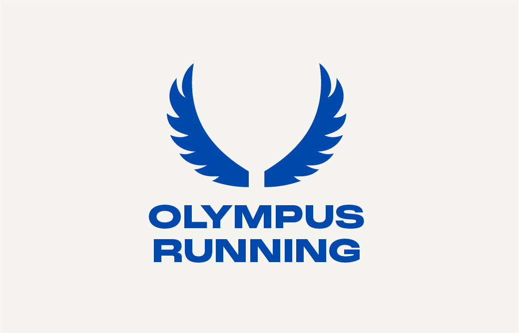
The name “Olympus Running” hit me. It felt perfect: strong, historic, and competitive. We wanted our channel to reflect the spirit of running while tying it to the legacy of ancient Greek athletics. From there, we moved on to the logo. We decided to use symmetrical wings, inspired by Hermes, the Greek god known for his speed and agility. The wings represent movement and speed, both of which are central to what we want to convey through the channel. The final logo features clean, symmetrical wings extending outward, designed to be sleek and simple. It reflects balance and precision, qualities we want to capture in both our content and our approach. The wings symbolize forward motion, driving the message of always pushing ahead and striving for better performance.


During the design process, one of my main goals was to create a brand that would stand out in the crowded world of running content. I focused on developing a bold, high-contrast color palette featuring rich royal blue, vibrant orange, and clean neutrals to give the channel a strong, cinematic presence that would instantly grab attention on platforms like YouTube. These colors, combined with sharp, modern typography and motion-driven visuals, helped bring energy and clarity to the brand. Every design choice was made to capture the energy and drive of the sport — bold, fast, and built to compete.